ProducePay is a leading AgTech startup revolutionizing the global agricultural supply chain by connecting farmers with buyers. The platform offers innovative financing solutions, helping farmers optimize cash flow and manage operational costs.
ProducePay Platform is a robust, enterprise-grade B2B web application that provides financial solutions and valuable data insights to the agriculture sector.
I led the UI/UX design for its main product and developed marketing campaigns.
ProducePay’s rapid growth highlighted the need for a web platform redesign, as its outdated legacy design was hindered by usability challenges and technical limitations. With a growing product roadmap, a redesign was essential to support future scalability and flexibility for new features. Given the tight deadlines, the plan was to launch new features while simultaneously working on the redesign.
Key areas of focus for the design objectives:
I conducted a UX audit of the web platform to identify usability issues and enhance the user experience. Collaborating with the product manager, I analyzed user flows, focusing on shipment details, billing, and payment processes. I also performed a heuristic evaluation to spot design issues like inconsistent button styles and the absence of a delete confirmation dialog.
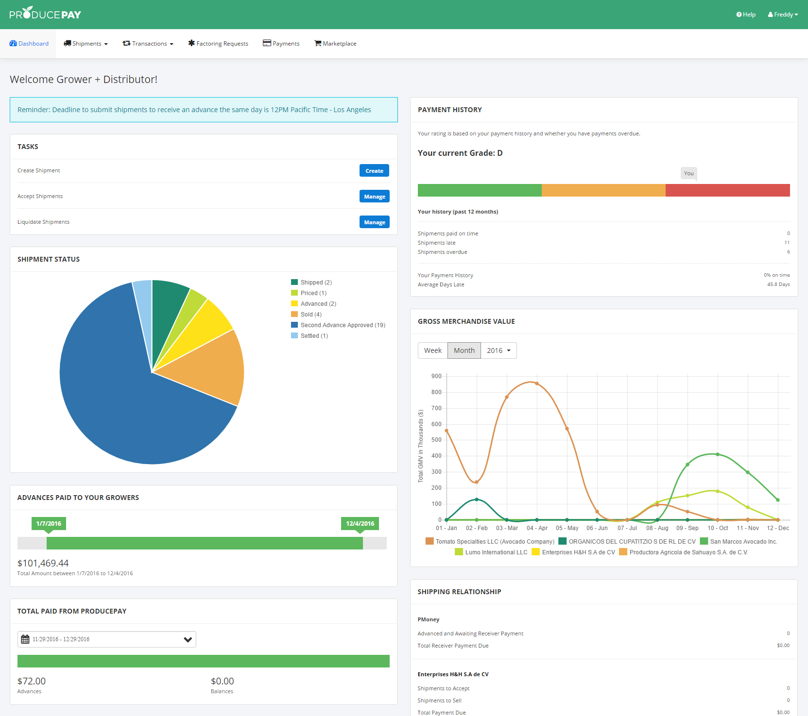
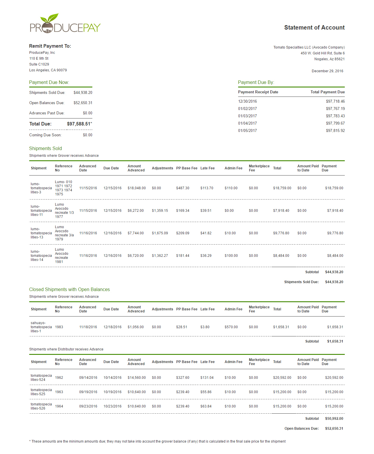
We analyzed user behavior using data analytics, focusing on metrics like average time on page. This revealed that one specific page caused long pauses in user activity due to multiple buttons clustered together, which created confusion. A review of support tickets further uncovered additional issues, including the lack of Spanish language support. Additionally, many users preferred for having shipment details and billing information displayed on the same page, rather than requiring a separate click to access billing.
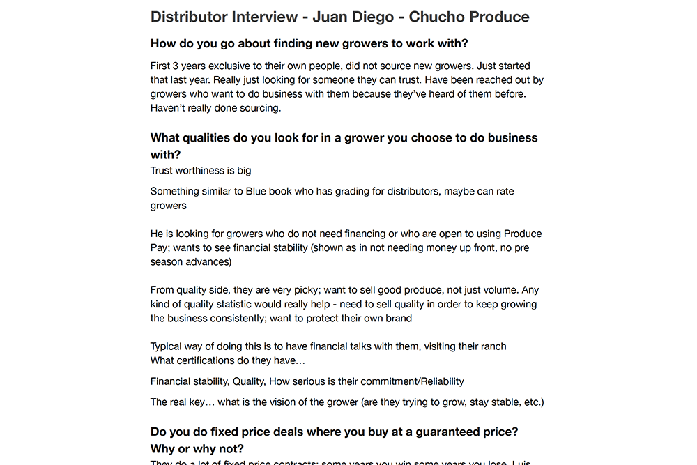
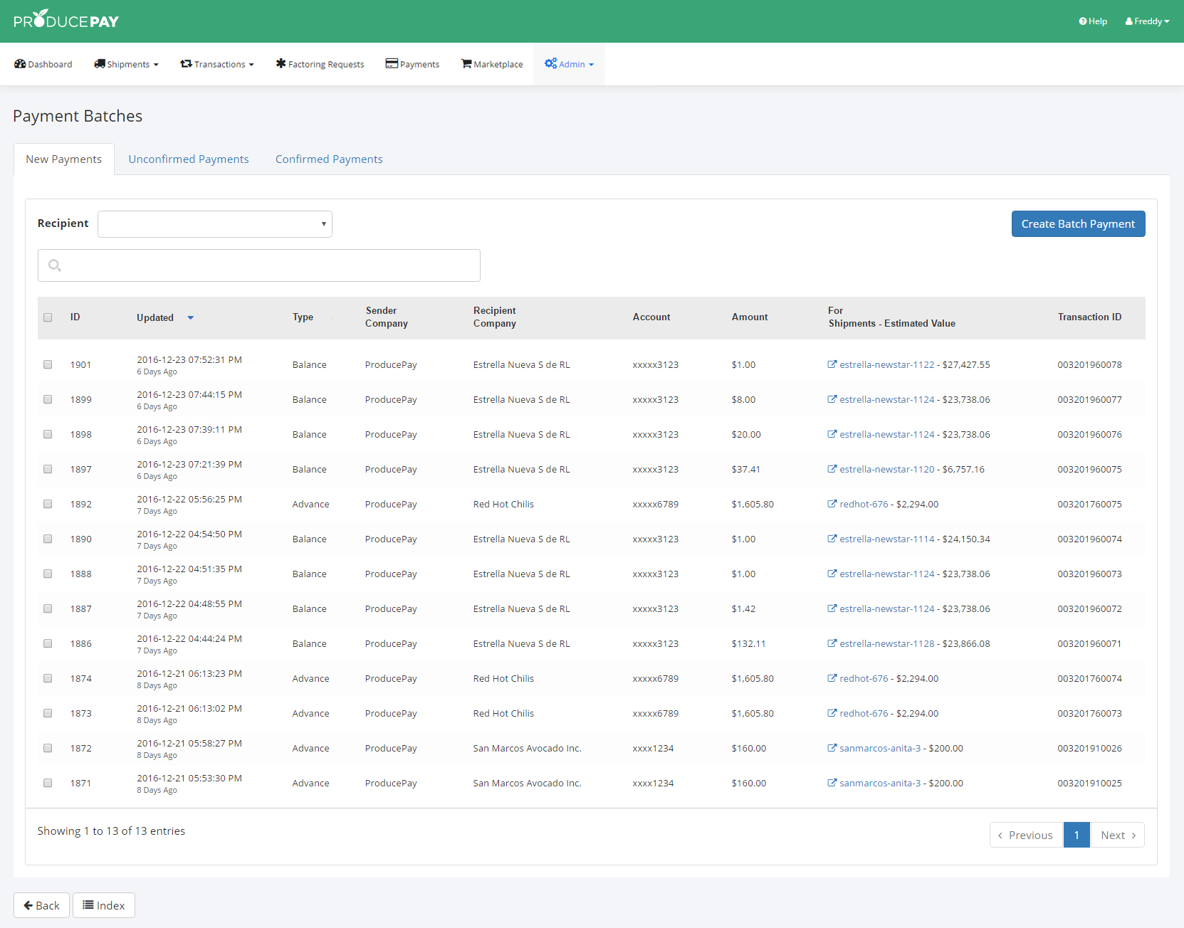
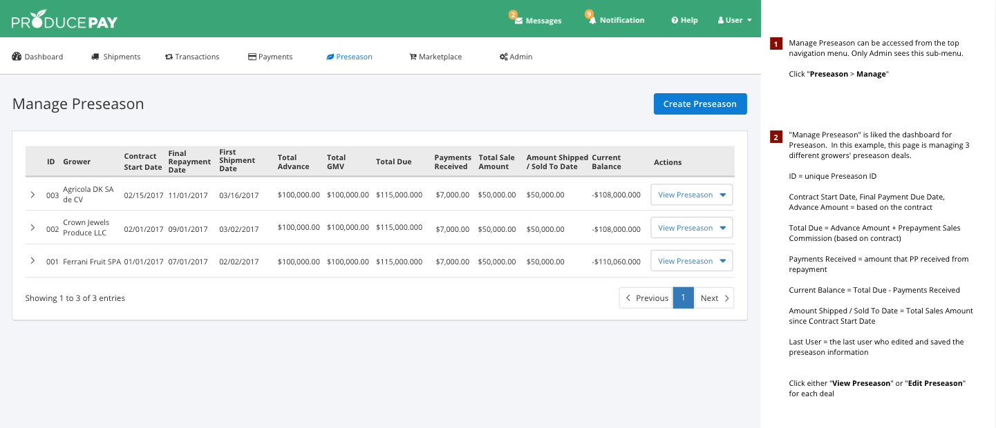
A key step in the process involved conducting interviews with both internal stakeholders and customers to better understand their needs and pain points. One common request from users was to make the fonts slightly smaller, as many of them were power users of Microsoft Excel. They were accustomed to working with data on a single screen and preferred minimal scrolling. These insights helped prioritize redesign improvements, and influenced the planning of upcoming features like Pre-Season Financing and Payment Batches. We then organized brainstorming sessions with teams from finance and engineering to explore ways to enhance the user experience and introduce new features, while taking technical constraints and business requirements into account.
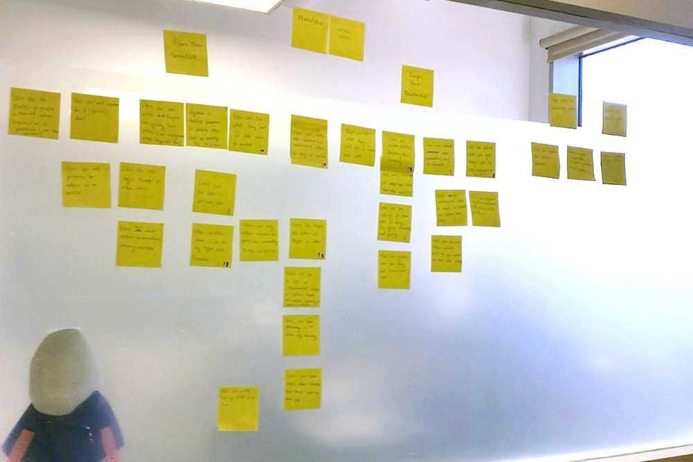
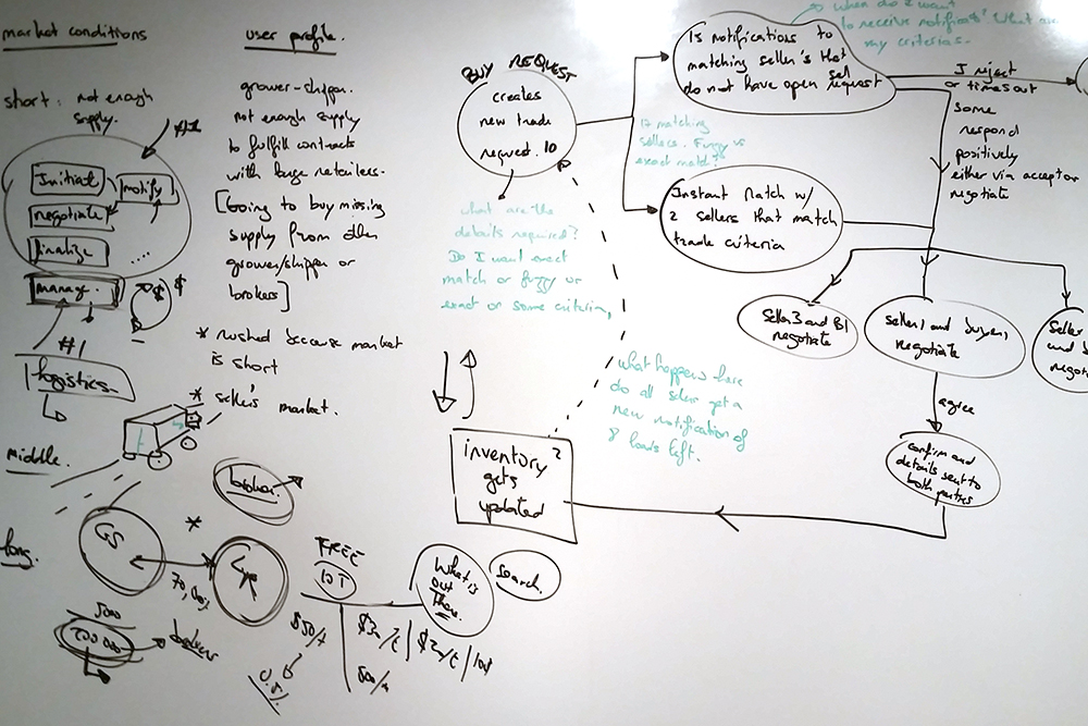
Once we had gathered sufficient data from the previous research activities, the product manager outlined the user stories, while I focused on finalizing the updated information architecture and refining the user flow, incorporating new dashboard requirements and anticipated features like Pre-Season.
After several rounds of iteration on the user flow, I proceeded to create a new color theme and UI components for the redesign. As the engineering team informed me, certain UI components, such as the data tables, could not be modified, so I had to account for this limitation while balancing the new look and feel. Finally, I began working on the high-fidelity mockups once the color theme was approved.
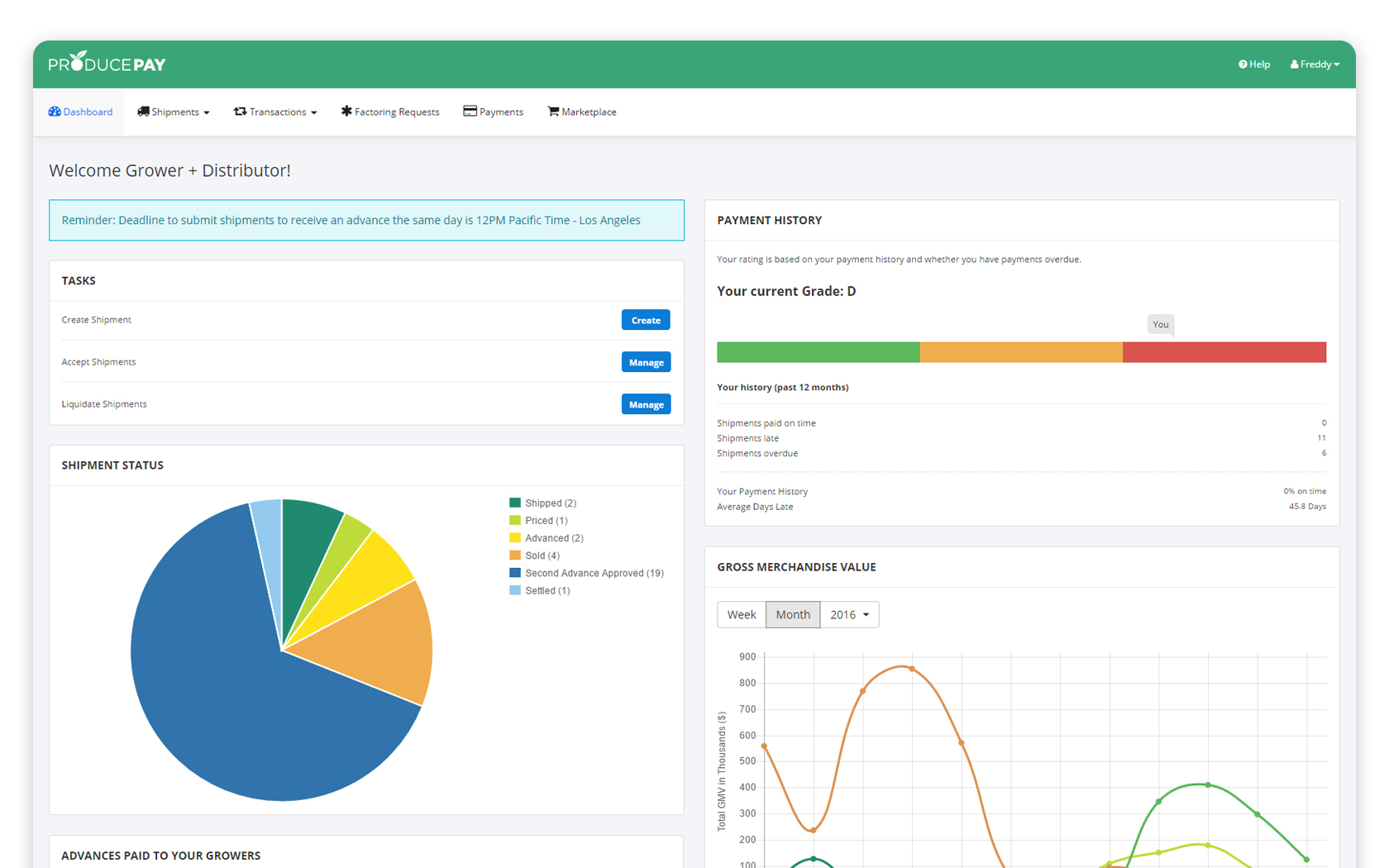
Due to tight deadlines and limited resources, we focused in presenting hi-fidelity mockups to our customers to gather quick feedback on visual hierarchy and user comprehension. For instance, with the redesigned dashboard featuring new charts and key metrics, we wanted to ensure that users could quickly understand and interpret the information.
During this stage, we closely collaborated with several clients to ensure they clearly understood the redesigned UI, navigation, and user flow...etc. After several rounds of revisions to the mockups, everyone was satisfied with the redesign, allowing us to move forward to the development stage.
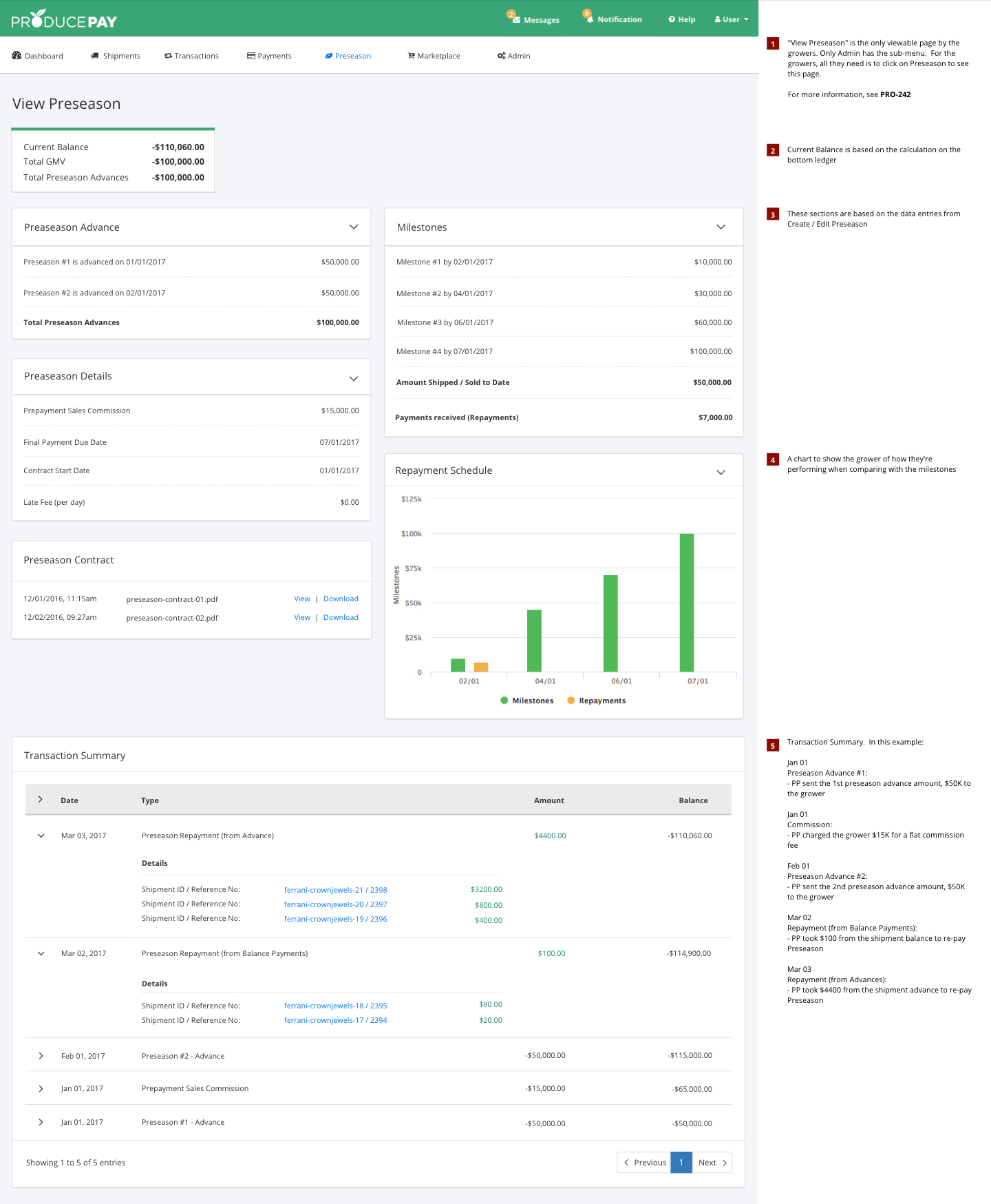
To keep this section brief, after the release of the redesign, I transitioned to working on a new feature called Pre-Season, which provides short-term loans to help farmers finance their harvest period. Since we had already gathered the necessary research and requirements during the redesign phase, I was able to quickly design this feature, iterating based on stakeholder feedback over several rounds.
The redesign of the ProducePay platform has been a huge success, garnering positive feedback from clients. They praised the updated dashboard for its enhanced functionality, simplified search, and more organized layout, making it easier to access key data quickly. These improvements resulted in a nearly 30% drop in customer support tickets, as users benefitted from a more intuitive workflow and clearer navigation. This allowed them to accomplish their tasks faster and with less frustration. Most notably, the redesign has generated significant excitement among our investors, playing a key role in securing our Series A funding after the launch.
Reflecting on my time at ProducePay, the fast-paced startup environment challenged me to expand my expertise by rapidly releasing multiple features while managing both staffs and projects. This experience also underscored the importance of collaboration. By fostering strong relationships with cross-functional teams, we were able to tackle challenges more effectively and drive innovation in the agricultural industry.