Masimo is a global leader in non-invasive medical technologies, specializing in advanced body sensors and devices for monitoring various vital signs.
Masimo SafetyNet is a SaaS based virtual care platform offering remote patient monitoring and telehealth services. By integrating wearable devices with mobile phones, it tracks patients' vital signs at home. Health data is transmitted to hospitals via a web platform, enabling real-time monitoring and alerting clinicians to critical changes for timely intervention.
I was solely responsible for the end-to-end design of its clinician-facing web platform, and partially involved in designing the UX for the mobile app.
Masimo SafetyNet, initially launched in 2014 for remote oxygen saturation monitoring, saw a surge in use during the COVID-19 pandemic. However, post-pandemic, adoption declined as healthcare systems shifted focus toward more integrated solutions for post-surgical and chronic disease management. The platform lacked critical device integrations and features, which led to workflow inefficiencies, and usability challenges. As a result, Masimo SafetyNet struggled to meet evolving user needs and fell behind competitors.
To regain market competitiveness and better support clinicians and patients, Masimo focused on two key initiatives:
How might we help clinicians efficiently monitor a broader range of vital signs, like ECG and glucose within Masimo SafetyNet, by redesigning key patient views to support faster decisions and better care for post-surgical and chronic patients?
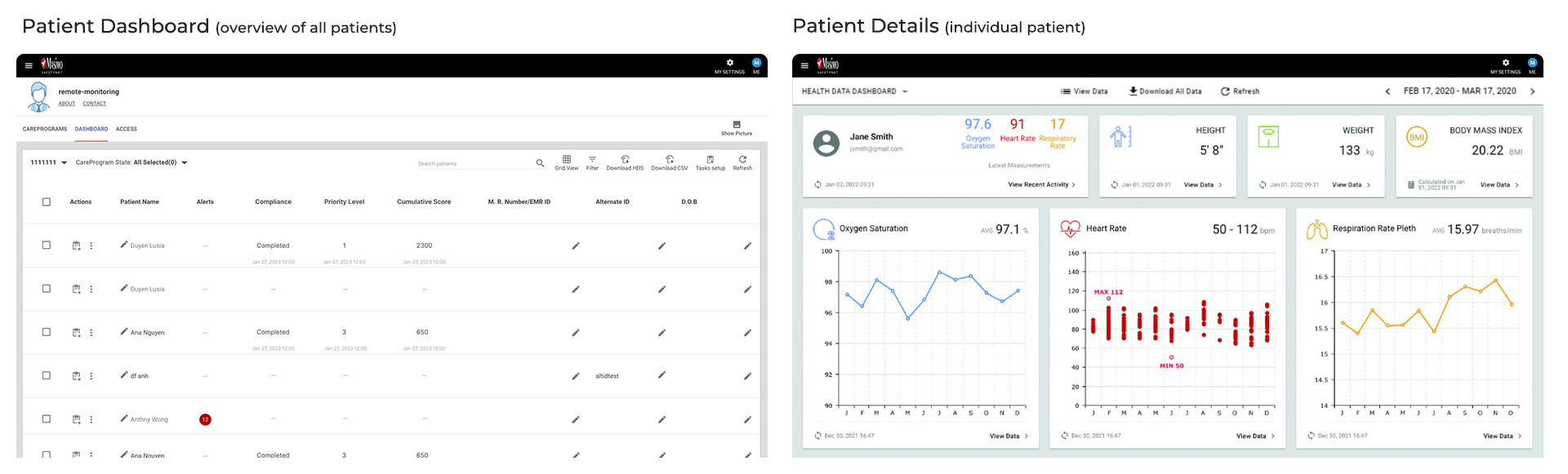
The product team and I aligned early on that the redesign would focus on two core areas of the clinician web platform: the Patient Dashboard (overview of all patients) and the Patient Details (individual patient data). However, many requirements were still unclear, particularly regarding the extent of the redesign and how new health data like ECG and glucose should be visualized and integrated into clinicians’ workflows.
To address these ambiguities, we established a set of focused objectives to guide our discovery and design process.
To ensure the redesign aligned with business goals, technical feasibility, and clinical needs, I collaborated closely with the product team and occassionally research team to conduct a series of stakeholder interviews. These sessions included teams from sales, software & hardware engineering, and clinical.
Key Insights:
Our primary user research was conducted through interviews with clinicians from partnered hospitals who currently use Masimo SafetyNet. The objective was to uncover usability challenges and identify opportunities for improvement. The platform’s most frequent users are nurses working in specialized care units, virtual care, or other telehealth roles.
There were 8 interviews with clinicians, mainly nurses. Before each interview, participants completed a brief questionnaire to capture patient profile details and contextual information about how they use the platform. This helped us tailor the interview protocol. During the sessions, we focused on the two key patient related views, Patient Dashboard and Patient Details. We asked participants to walk us through specific tasks referenced in their questionnaire responses.
Key Insights
Key Pain Points
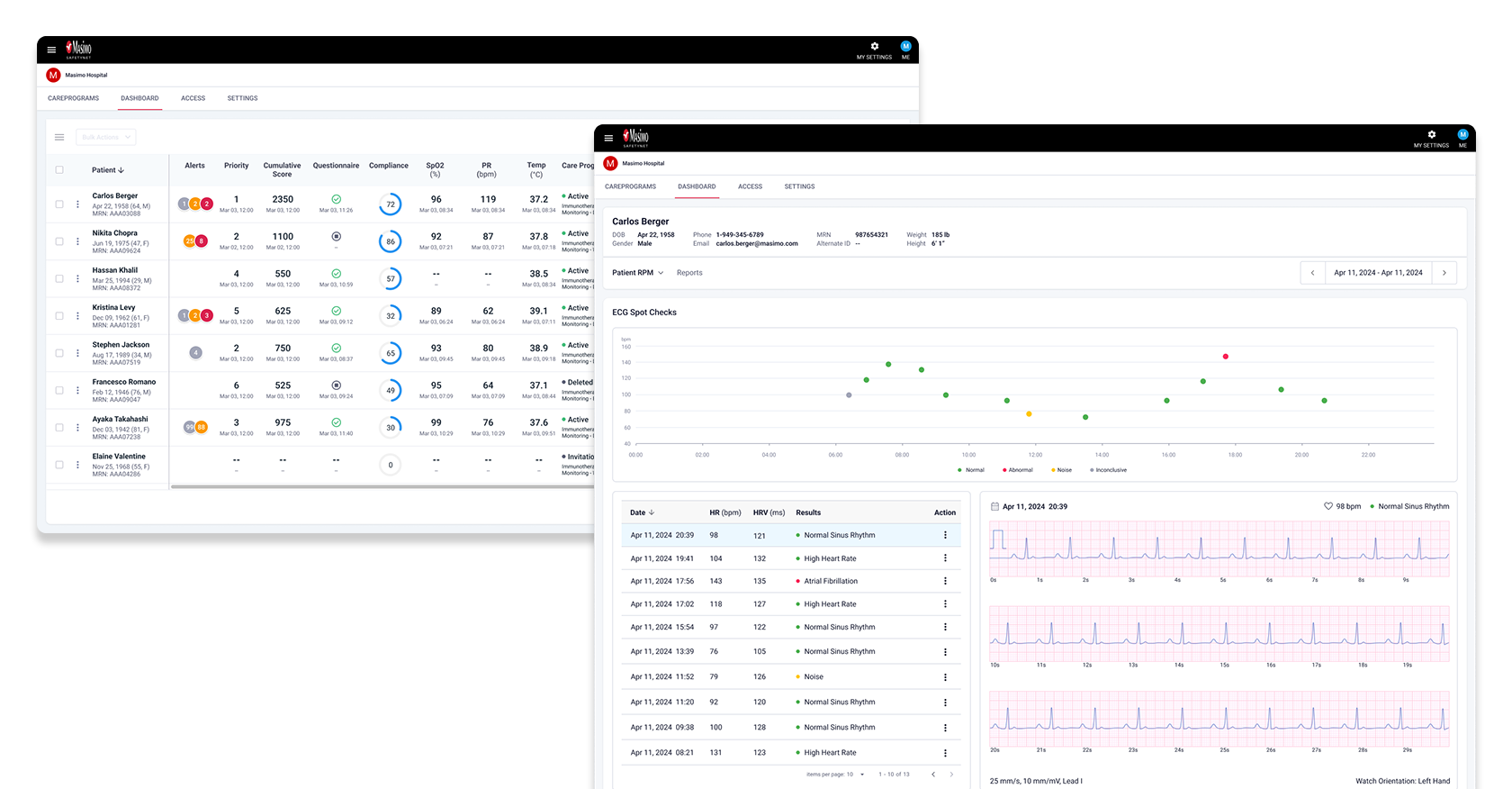
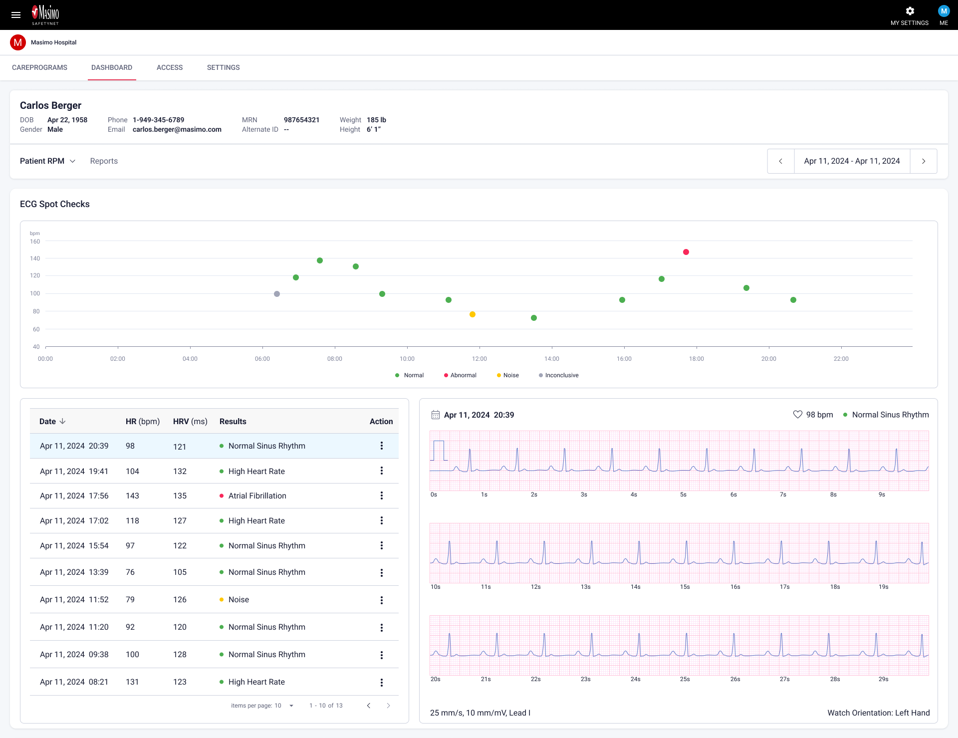
To design the new ECG / heart condition feature in the Patient Details view, our Chief Medical Officer, formerly a cardiologist provided hands-on training sessions. These were especially valuable for helping our team understand how clinicians interpret ECG chart and data, as well as what design elements are clinically important. He also shared a clear vision for how the feature should function.
Key Insights:
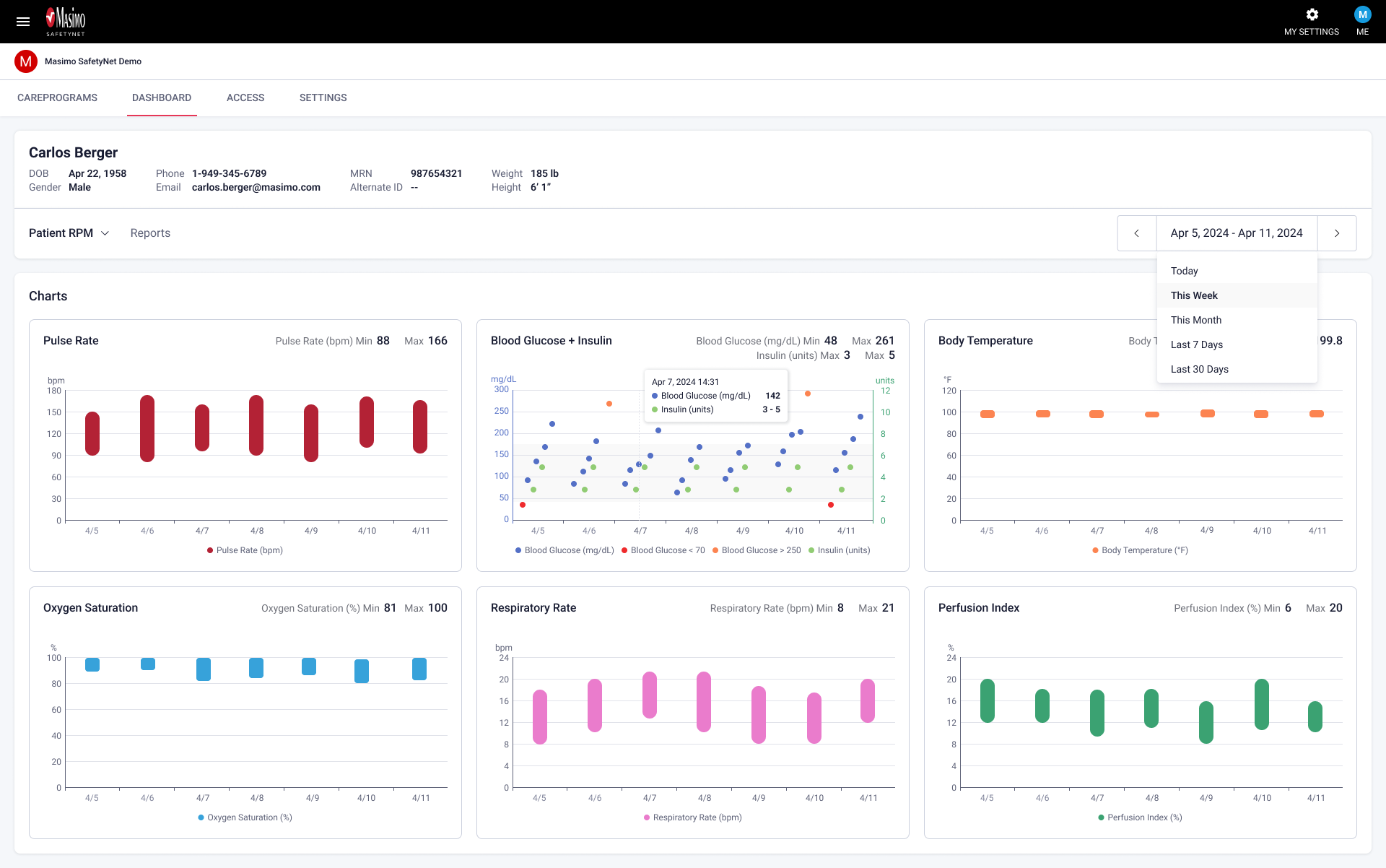
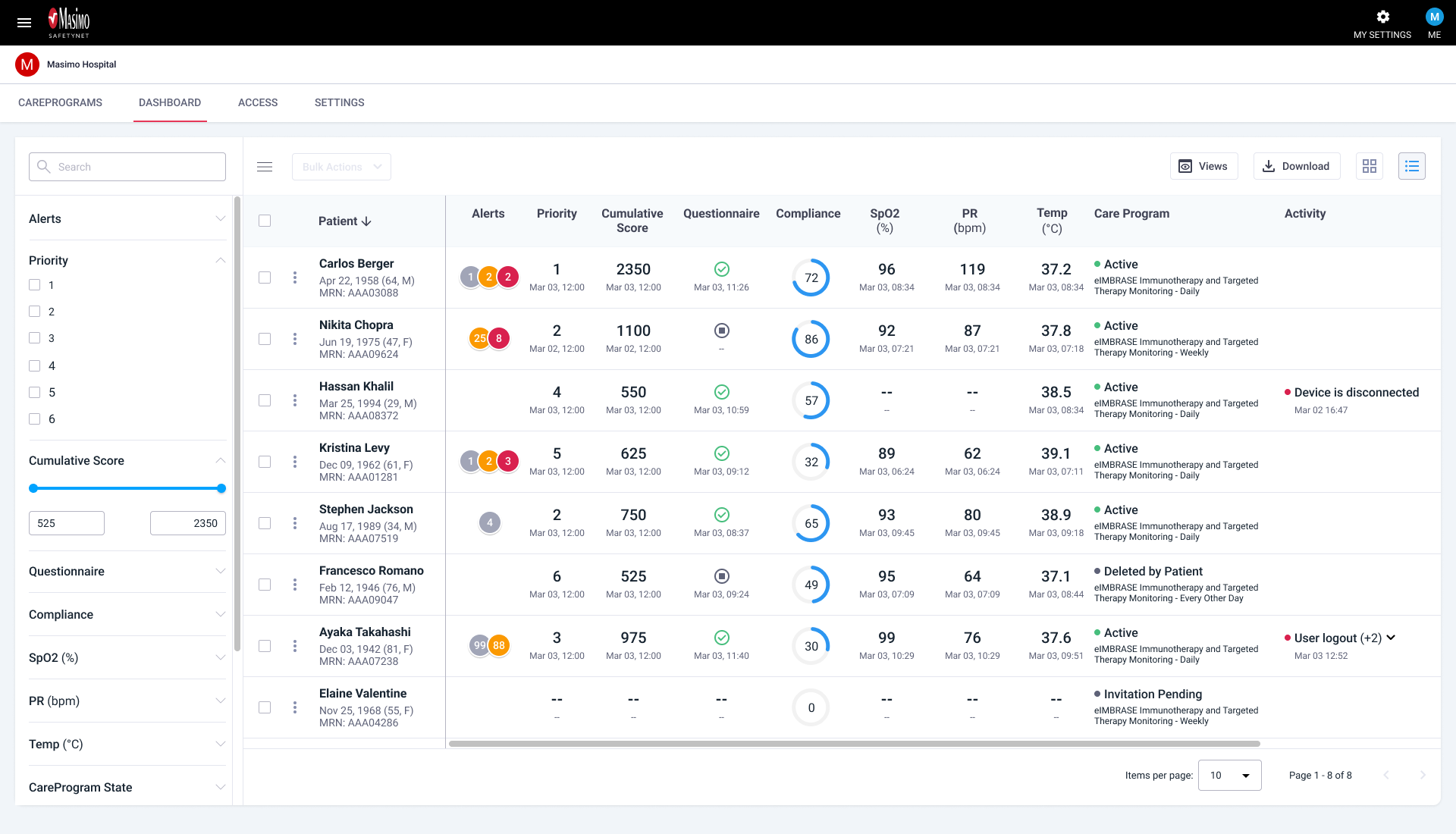
As part of the product roadmap, the Patient Details view was prioritized for the first release alongside the new ECG feature. Based on synthesizing insights from user interviews and research analysis, we found that clinicians were generally satisfied with this page, particularly the accuracy and clarity of the health data charts.
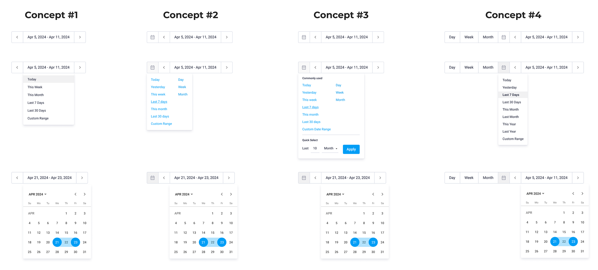
However, several areas needed refinement. The profile section should display more relevant information instead of fixed data, and the date picker was limited in functionality, which slowed down task efficiency. Addressing these issues became key opportunities to improve usability and streamline clinical workflows.
Explore redesign solutions - Patient Profile
I explored multiple design concepts for the patient profile and iterated several times before we ultimately moved forward with the latest version. While the earlier iterations were visually appealing, they didn’t align with real-world usage. For example, patients rarely upload profile photos through the mobile app, making prominent photo placement unnecessary. Additionally, since some patient names can be quite long, dedicating a full row to the name improved readability and layout flexibility.

Explore redesign solutions - Date Picker
After speaking with two nurses to better understand their workflows and use cases, I explored several design concepts and gathered their feedback. We ultimately chose Concept #1 for its simplicity and ease of use. It resembled the previous version but included additional features that improved functionality. While the other concepts addressed more specific scenarios, they mostly catered to niche use cases.
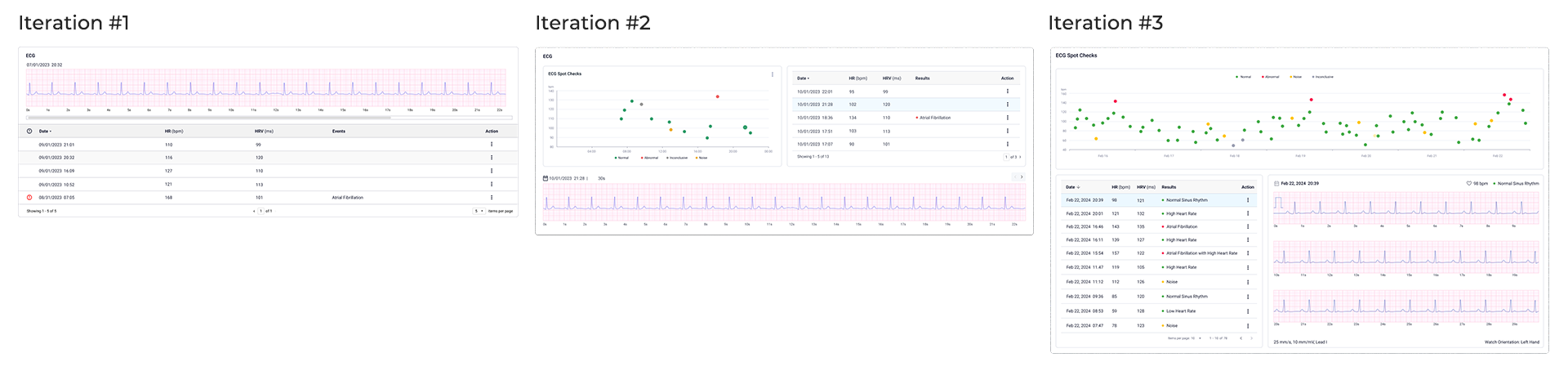
Explore design solutions - ECG Chart
Before starting my design, I researched several competitors to understand how they approached similar features while ensuring my design remained distinct enough to avoid potential patent issues. I iterated multiple times, guided by the Chief Medical Officer’s vision, and explored several directions. Along the way, we also received feedback from other partnered hospitals. Ultimately, the final version offers the most robust set of features.
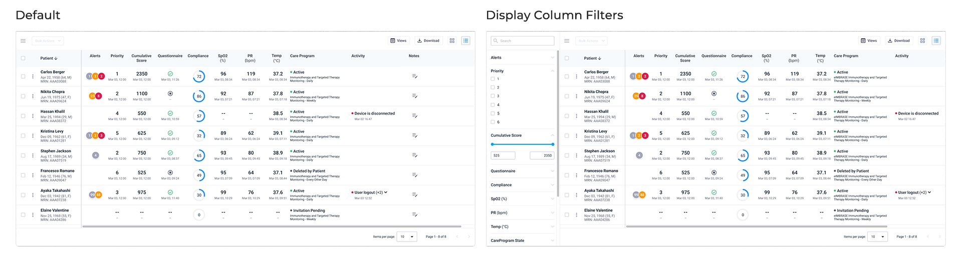
Following the release of the Patient Details page, I began redesigning the Patient Dashboard—a data-dense table with numerous actionable columns and filters.
Key updates
Each feature often underwent multiple rounds of usability testing to refine the design and ensure user involvement before passing high-fidelity designs to engineering. Regular QA and spike testing sessions with engineering occurred prior to each feature launch.
I collaborated with the research team to test prototypes with nurses from our partner hospitals, assessing new features and design changes. Key metrics included task success rate, completion time, error rate, and navigation efficiency, with occasional A/B testing for specific elements.
Constant communication with nurses provided qualitative insights into user preferences, helping refine the design to align with clinical standards and user needs. For example, during a chart configuration test, initial feedback revealed confusing workflows and unclear instructions. After revising the design and gathering more feedback, users completed the task faster and more successfully in the final test.
Many of these redesigns and new features have been rolled out to select clients for clinical testing and regulatory review. The feedback has been overwhelmingly positive, with participating hospitals reporting significant improvements in their daily workflows. By closing feature gaps with competitors, we have successfully attracted more new hospital clients worldwide, including Cleveland Clinic and Saint-Denis Hospital Center in France. Additionally, our renewal rate has increased from the 70% range to the 80%, reflecting stronger client retention. Seeing these updates drive higher satisfaction among our hospital partners has been incredibly rewarding.
Our product and engineering teams have learned the value of involving users throughout the design and development process. This approach fostered trust and enthusiasm, keeping our hospital clients engaged every step of the way. Most importantly, knowing that my designs help improve patient outcomes has been incredibly fulfilling. Looking ahead, I’m especially excited about the next major feature, clinical notes AI, as I anticipate how AI will further enhance workflow efficiency for our users.